Formatting is just window dressing, right? Wrong.
It doesn’t matter how incredible your content is if the way you present your blog post fails.
Starting now, forget the rules you learned for structuring your high school English papers. Stop treating your blogs posts like they’re excerpts from a 300-page book.
To be successful, your blog post’s format must make scanning for information absurdly easy.
Understand that your blog reader has very unique needs. She wants information quickly. She needs to be able to figure out in seconds whether your blog post provides that information. She might be reading your content on a phone or tablet.
And she just might want to stick around on your site, share your content, or buy your product if you play your cards right.
Create an inviting, professionally formatted blog post by avoiding these common errors:
Your fonts cause eye strain.
For headers and special tidbits of text, it’s perfectly okay to use a font with a little flair. For the meat of your text however, use a font that’s friendly on the eyes. Skip the script and fancy fonts.
Then make it big — bigger than you think. ProBlogger recommends a minimum font size of 16px. Some fonts look fine at 16px; others need a boost to 20px (or more!) to be reader-friendly.
Now get your color choices right. It’s hard to go wrong with black or dark gray text against a white or off-white background. Just be sure to use font colors that stand out from your background.
You’re force-feeding text to your audience.
Your readers will click away in a split second if you greet them with a massive wall of text.
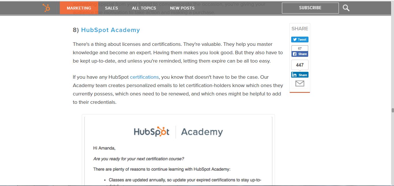
In order to create an inviting, balanced, and visually appealing blog post, it’s essential that you incorporate lots of white space on your page.
First, create gigantic left and right margins for your text. Your post shouldn’t look like a Times Square billboard that streams content continuously across its entire width. Keep the left-to-right word count to 20 at a maximum.
Have a look at HubSpot’s generous margins on either side of the text:
Second, put a buffer around every line of text.
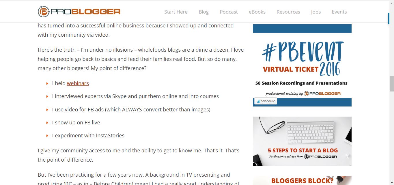
Forget about single spacing. Start with 150% spacing and preview the result on your blog post.
Do your words look cramped? Are they too far apart? The answer will vary depending on your font choice, font size, and personal preferences. Adjust to 140% or 160%, preview, and iterate until you’ve got the perfect line spacing.
Note the refreshing breathing room on ProBlogger’s blog, which uses line spacing in excess of 150% for a clean, readable look:
Your post lacks structure.
Headers (and sub-headers) are the guideposts that anchor your ideas and convince your audience to read your blog.
Think of headers as the preview you’re offering your readers before they commit to reading the fine print.
A typical reader who clicks his way over to your blog post does so after you whet his appetite with a snappy headline that piques his curiosity or promises specific relief to his pain points. Once he’s on the page with your post’s full text, he’ll most likely skim the headings and subheadings to ascertain the direction your post is going.
Does it actually contain solutions to the problem he has? Are there innovative ideas or captivating copy selling each section of text to him?
It takes only a few seconds for your reader to size up the main points in your headers and decide whether to dive in to the post or navigate away from your site.
So. Use headers and pick your words carefully. Make headers concise and clear without giving away the entirety of the content contained in the text that follows.
Your audience will thank you.
You lose your audience halfway through a sentence.
Writing a blog post is nothing like drafting a paper for English Lit.
Flowery sentences, long prose, and hefty paragraphs will frustrate the majority of readers. These readers absorb information by skimming, so your text needs to make that process as easy as possible.
Keep your sentences short and your paragraphs tight.
Create paragraphs with no more than 5 lines of text. You want to make it easy for readers to tell, at a glance, what point you’re making in each paragraph.
And don’t be afraid of a one-sentence paragraph.
They’re fantastic for emphasis, key points, and interjections.
You think text is the only way to convey information.
Images are everything.
A single featured image is a proven way to pique a reader’s interest enough to click over to your blog or dive into a post.
Depending on the type of content you’re conveying, your post can really shine with some additional images.
Relevant photos in a style appealing to your reader or humorous GIFs might be perfect. Graphs, diagrams, and embedded videos can be a fantastic way to convey information in a non-text format. Infographics are a brilliant way to liven up otherewise-dull information and are incredible tools for garnering shares and driving traffic back to your blog.
Finally, consider a title image — an inviting graphic design with your blog post’s title and your blog’s name. They catch potential readers’ eyes when you link to your post on Twitter or Facebook. They make your posts shareable on Pinterest. They create visual interest while providing information on the post content.
Your text formatting is all one note.
Go a step further in avoiding the wall of text, and think beyond headers.
Of course, incorporate images where needed but also to give readers a break from endless reading and scrolling.
Got a set of points to make? Choose bullets or numbered lists. Have a unique idea or quotable sentence in your post? Highlight it with a blockquote or a Click-to-Tweet box in the middle of your post.
Have a quotable sentence in your post? Highlight it with a Click-to-Tweet box.Click To TweetThese features will pop as readers scroll through your post.
You don’t highlight key points.
Be bold. Emphasize your most important information.
Bold text catches the eye and helps your reader pick out important facts and advice in your post. Plus, it can create interest. Highlight a question or a surprising fact, and your audience will read the text that follows to learn more.
Of course, use bold sparingly. You don’t want your reader to go blind to it or hate you for having the majority of your text so in-your-face.
You’re a stickler for grammar.
Your English teacher isn’t watching. Go ahead and break some grammar rules.
Blog posts are all about talking the way that your audience talks. You want your words to be extraordinarily clear. If your reader gets to the end of a sentence and has to re-read it — not because it was insightful but because she has no idea what you just said — your words have failed.
I’m a lover of good grammar, but I know that there’s a time and a place for you to start a sentence with “and” or “but.” (Gasp!) End your sentence with a preposition. Split your infinitive if good grammar would sound stuffy to your reader.
You can even create one-word sentences for emphasis. Just. Like. This.
You forget your audience.
Don’t pretend you’re writing in a vacuum when your whole purpose is to connect your readers with your information.
So break the 4th wall and address your readers directly. Ask questions! Try posing your questions throughout your blog post for maximum impact.
Neil Patel does an excellent job of addressing his reader by using questions twice in this one section of his blog post:
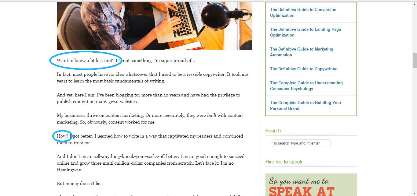
Questions are an excellent means of relating to readers, driving your content forward, and interacting with your audience.
You drop the ball at the very end.
It’s critical that you wrap up your post with a CTA.
A call-to-action (or CTA) is your final word to your reader when he reaches the end of your blog post. Don’t blow the opportunity that your engaged reader presents to you!
Many bloggers shy away from calls to action or couch them in polite but weak terms.
Don’t. Tell your readers exactly what you want them to do:
- Download a free guide.
- Leave a comment.
- Share the blog post.
- Offer a suggestion.
- Sign up for an upcoming e-course.
- Buy a product.
- Read the next post in your series.
- . . . and more.
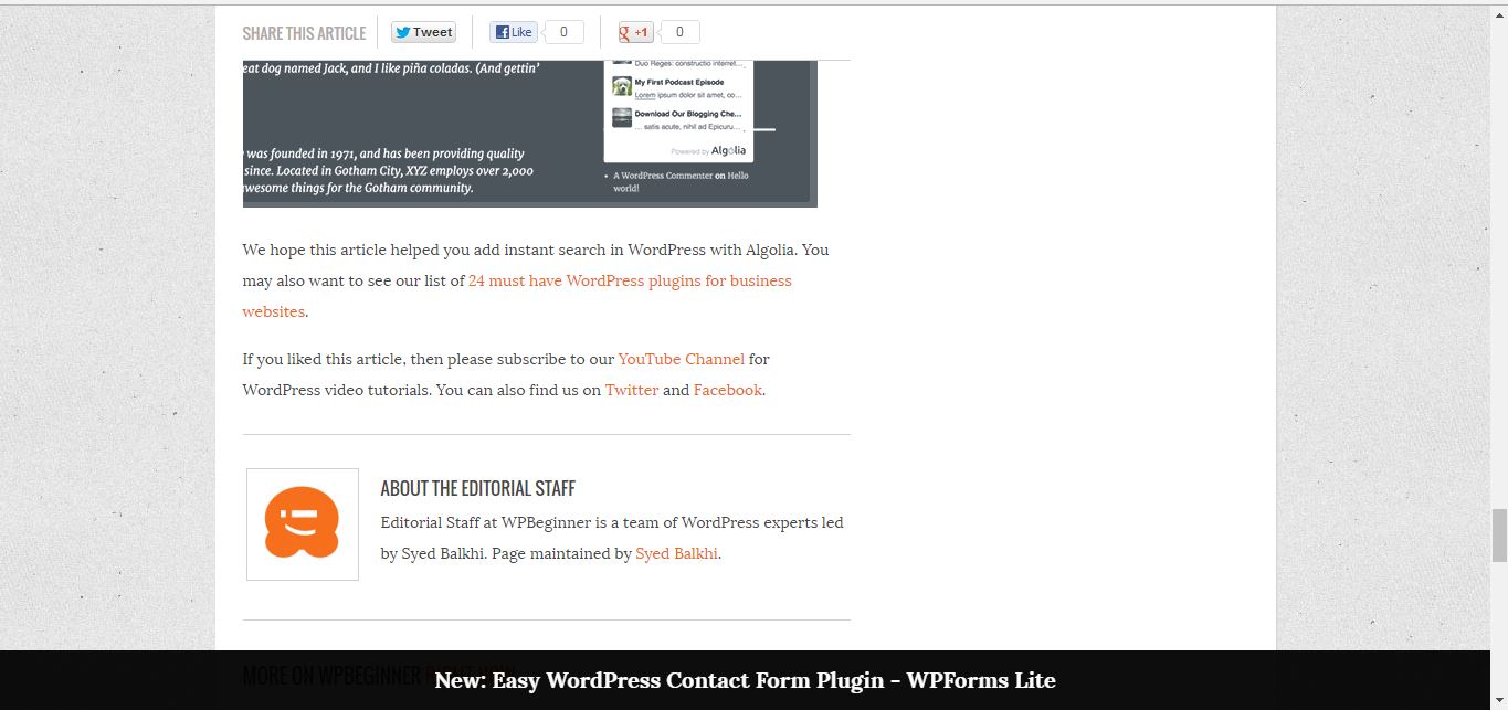
WPBeginner concludes its post with a recommendation for further reading and a call for readers to follow WPBeginner on social media:
The Write Life poses a (bold!) question to its readers, inviting them to comment, while also encouraging readers to share the post on Facebook and Twitter:
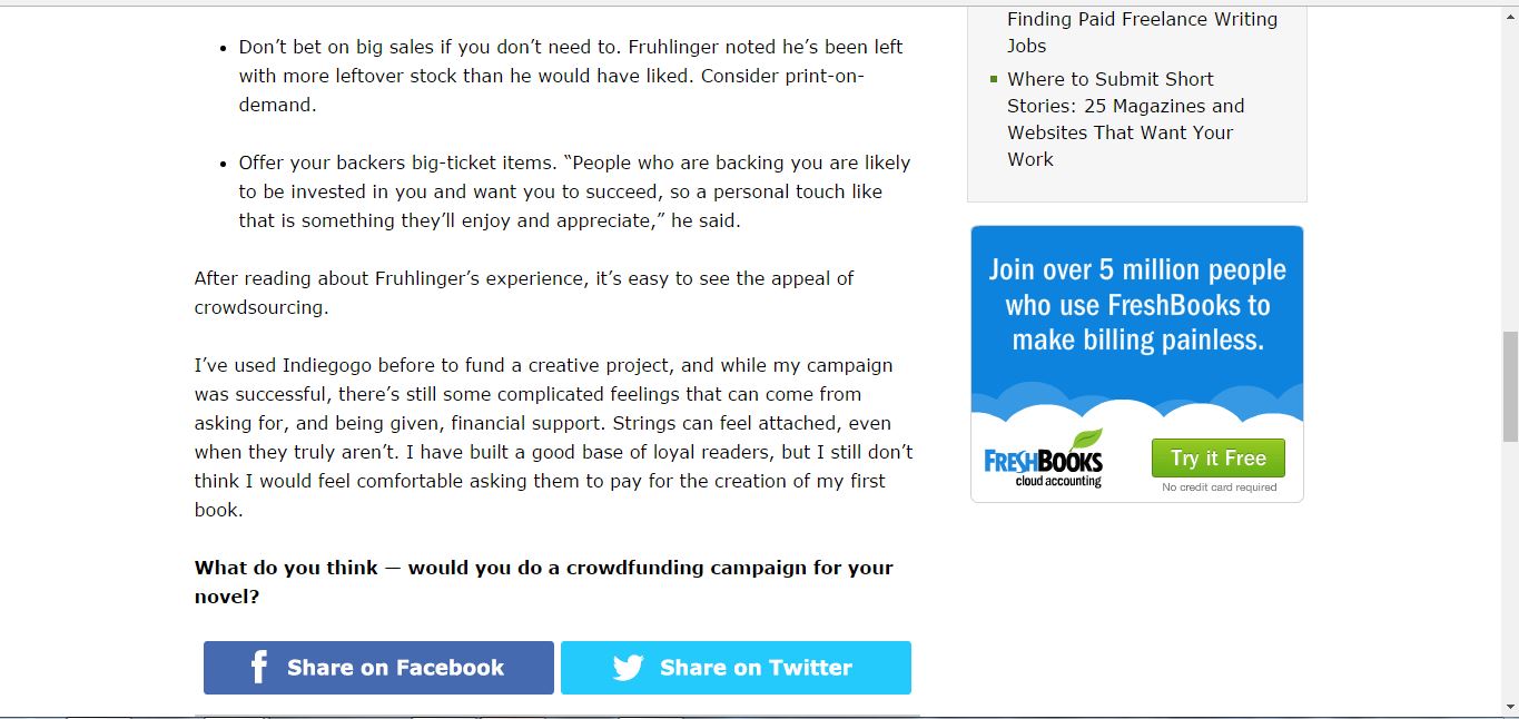
The readers who arrive at your CTA are the ones who have enjoyed your content enough — and found it relevant enough — to hang in there until the end of your post. So hold on to them just a bit longer and tell them to take the next step, engage, promote, share, and more.
Did you enjoy this post? Use the share buttons below to tell your friends!
Author: Megan Nye
Megan Nye is a personal finance freelance writer and content strategist. Her writing transforms even complex money matters into easy-to-understand and actionable information. She frequently covers topics of credit & debt management, retirement planning, investing, insurance, mortgages and loans, college planning, budgeting, and financial literacy.
Megan works exclusively with financial services businesses to create articles, infographic copy, and case studies. Her writing has been featured by Business Insider, U.S. News & World Report, Credit Karma, Citi, Wells Fargo, American Express, Prudential, U.S. Bank, Discover, Quicken, Fidelity Investments, and Merrill Edge.
Диплом техникума купить официально с упрощенным обучением в Москве
s24.team/club/user/148/blog/1731
Как купить диплом о высшем образовании с минимальными рисками
crtdu-kras.ru/communication/forum/user/260105